
📣 Create Blog for Traders!
Stop Watching news - Start Making it.
START


Bitcoin's Rainbow Chart is a Trap for Retail Investors
Everyone is calling for a 'deeply oversold' bounce based on a simple chart. The on-chain data I'm watching tells a completely different, more dangerous story.
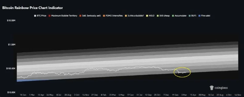
My feed is plastered with the Bitcoin 'Rainbow' chart this morning. Everyone is pointing to that pretty blue band at the bottom, claiming BTC is in a 'fire sale' zone at $71,522. It's a simple, comforting visual that screams 'buy the dip'. And I think it's a massive trap. I've been in this game since 2017, and if the 2018 crash taught me anything, it's that the easy, obvious signals are almost always the most dangerous. While retail traders are buying based on a coloring book, the real story is hidden in the on-chain data, and it's flashing yellow, not green.
The Rainbow chart is a logarithmic regression model. It was a useful tool in a retail-driven market where cycles were somewhat predictable. But this is 2026. The market structure has fundamentally changed. We have spot ETFs, sophisticated derivatives markets, and institutional players who don't care about colorful charts. They care about liquidity, order books, and funding rates. As I pointed out to Luna Park last week when she covered the pause in ETF flows, the institutional bid is getting soft. Relying on a model that ignores these new capital flows is like trying to navigate a highway with a map from the 1800s.
This morning, the first thing I checked was open interest and exchange netflows. While the price has stabilized, open interest hasn't been wiped out, meaning there's still a lot of leveraged froth in the system. More importantly, my Glassnode screen shows exchange netflows have been flat to slightly positive for the past 72 hours. This isn't the signature of a bottom. A real bottom is formed when whales are pulling coins off exchanges in droves, not when coins are trickling onto them, potentially for selling.
The market gives you signals, not coloring books. The Rainbow chart is a distraction; the real story is in the on-chain data, and it's telling me to be patient.
Forget the rainbow. Let's look at the metrics that matter, the ones that track actual capital and sentiment.
- MVRV Z-Score: It's currently sitting at 2.6. Historically, generational buying opportunities happen when this score is below 0. We are nowhere near capitulation; we're closer to a local top distribution zone.
- NUPL (Net Unrealized Profit/Loss): The market is in the green 'Belief - Denial' phase. The color you want to buy is the deep blue 'Capitulation' zone. We have a long way to fall before we hit that.
- Stablecoin Supply Ratio (SSR): It's not showing a massive pile of dry powder on the sidelines ready to bid. The buying power isn't coiled and ready to spring like it was in late 2023.
- Crypto Fear and Greed Index Today: We're hovering around 55 (Greed). A true bottom is carved out in 'Extreme Fear', usually a reading below 20. This is complacency, not panic.
This combination of data tells me the market is tired and over-leveraged, not oversold and ready to rocket. The 'smart money'—the on-chain analysis bitcoin whales are tracking—is sitting on its hands, waiting for a better price.
So, what's my play? I'm not shorting BTC outright—that's a fool's errand in a structural bull market. But I'm absolutely not adding to my position here. I took profits on my SOL swing trade above $90 last week and I'm sitting on a higher-than-usual cash position.
The line in the sand for me is the 200-day moving average, currently around $65,800. A daily close below that would signal a much deeper correction is likely, with a possible test of the $60,000 - $62,000 support zone. That is where I would get interested in buying again, provided we see the on-chain metrics reset. On the upside, the bulls have to reclaim $73,800 and hold it. Until then, this is just choppy, dangerous price action.
This reminds me of the oil market hype Jake Morrison keeps warning about. Traders see a simple narrative—a war, a colorful chart—and jump in, ignoring the underlying supply and demand dynamics. The same is happening here. People see a rainbow and forget to check if there's a storm brewing just behind it.
My thesis is invalidated if we see a massive spike in spot ETF inflows this week combined with a surge of exchange outflows, pushing us decisively through $74,000. But I'm not holding my breath. The data suggests patience will be rewarded. So, are you trusting a logarithmic rainbow to protect your capital, or are you looking at the hard data showing where the money is actually moving?