
📣 Create Blog for Traders!
Stop Watching news - Start Making it.
START


Google's 'Can't Sell My House' Spike: My Charts Say Sell
Record-high search volume for housing fear is a warning shot. But the real story has been painted on the charts for weeks. Here's my technical breakdown.
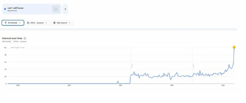
I was grabbing coffee this morning and overheard a couple talking about their neighbor's house. It's been on the market for three months, two price drops, and still nothing but crickets. The guy said, 'It's like nobody's buying anymore.' He's not wrong. I got back to my desk, saw the headlines about Google searches for 'can't sell my house' hitting an all-time high, and just nodded. The sentiment is finally catching up to what the charts have been telling me for a while now.
Look, this kind of news is the canary in the coal mine for Main Street. But for traders, the canary has been coughing for weeks. This spike in search interest is a lagging indicator. It's confirmation of a trend, not the start of one. While financial news is busy reporting on the fear, price action has already been pricing it in. I'm not a macro guy like Emma Blackwood; I don't trade narratives. I trade levels and volume. And the story the charts are telling is getting ugly.
My focus isn't on the headlines, but on the tickers that actually reflect this market. I'm watching the homebuilders like $LEN and $DHI, but my primary proxy for the whole sector is the iShares U.S. Real Estate ETF, ticker $IYR. It gives me a clean, broad view of the entire space without the noise of a single company's earnings. And right now, that chart is screaming weakness.
Pull up a daily chart of $IYR. The first thing that jumps out is the failure to hold above the 200-day simple moving average. That's a classic sign of a trend shift from bullish to bearish. We saw a sharp rejection from that level last month on heavy selling volume. That's institutional distribution, plain and simple. Big money is getting out while the getting is good.
We're now consolidating below all the key moving averages (21, 50, and 200). It looks like a classic bear flag is forming on the daily timeframe. For anyone looking for technical analysis for beginners, this is a textbook continuation pattern. It's a pause in the downtrend before the next leg lower.
- Key Resistance: The $82.50 area, which lines up with the 50-day MA.
- Key Support: The recent swing low at $77.00. A break here opens the floodgates.
- Volume Profile: Volume is drying up on this bounce, showing a lack of conviction from buyers.
- Target Below: The next major support level sits way down at $71.50.
But the real kicker for me was the setup from a few weeks ago. It's a perfect example of an RSI divergence strategy. Back in late spring, $IYR put in a higher high on the price chart. But if you look at the RSI(14) indicator, it printed a significantly lower high. That's a massive bearish divergence. It's a warning shot that the momentum behind the rally was fading fast. Price was going up, but the strength behind the move was collapsing. I've seen this pattern play out a hundred times, and it almost always precedes a significant drop. It's one of my A+ setups.
While I use price and volume as my primary tools, seeing a divergence like this gives me huge confirmation. It's not some magic bullet, but it's a powerful piece of evidence. I know quants like Alex Volkov probably have complex models for this stuff, but for a pure price action trader, a clean divergence on the daily chart is gold.
So, how am I trading this? I'm not short yet. Patience pays. My Achilles heel has always been jumping the gun, and I've been working hard on that. My trade journal is full of notes on 'waited for confirmation' vs. 'FOMO'd in.' For this setup, my entry trigger is a clean break and daily close below that $77.00 support level. No wick, a full-bodied candle close. That's my signal.
If I get that signal, my stop loss will go above the high of the bear flag, likely around $81.00. My first target is that support zone at $71.50. That gives me a risk/reward ratio of better than 1-to-3. I'll take that setup every single day.
What kills this idea? A strong, high-volume push back above $82.50. If buyers step in and reclaim the 50-day moving average, this bearish thesis is dead in the water. I'd close any short and move on. No ego. The market is always right.
Everyone's watching the Google searches now, but the charts have been whispering this story for months. Price pays, news delays.
This isn't just a chart pattern; it's a reflection of real-world pain starting to bubble to the surface. The data is just catching up to the price. My question is this: With rates still high, are we about to see the first wave of post-2020 homebuyers go underwater on their mortgages on a scale we haven't seen since 2008?